
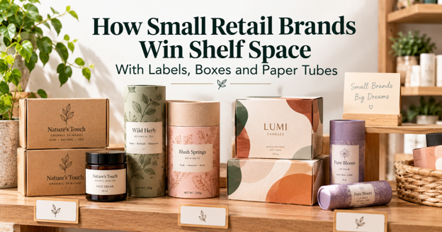
Walk into any independent shop on a Saturday and watch how people browse. They don’t read. They scan. A shopper looks along a shelf for two or three seconds, picks up whatever catches the eye, and only then starts reading. For a small brand sitting next to products with national ad budgets, that first glance is the whole game.
The good news is that winning the glance doesn’t take a big budget. It takes packaging that makes a few clear decisions and sticks to them. The brands that punch above their weight on a shelf usually do three things well. They use one strong colour or material so they’re easy to spot from a distance, they put the most important words where the eye lands first, and they choose a pack shape that stands out from the boxes around it.
This piece looks at how small retailers and makers are doing that with three tools that suit short runs, which are printed boxes, product labels and paper tubes.
The Three Second Test on a Crowded Shelf
Before changing anything, it helps to stand three metres back from your own display and look at it as a stranger would. Most owners are surprised by what disappears. Fine script fonts turn into a grey smudge. Pale pastel boxes blend into a white shelf. A logo in the corner of the lid is invisible once the box is stacked.
A few questions sort out most of the problems.
- Can someone tell what the product is from across the aisle, without reading the small print?
- Is there one colour, shape or material that belongs to you and nobody else on that shelf?
- Does the front face of the pack still work when the products are stacked or packed tightly?
- Is the brand name larger than the decoration around it?
If the answer to any of those is no, the fix is usually in the packaging, not in a new logo.
Choosing a Box Finish That Earns Its Cost
For most retail products the box is the biggest branded surface you own, so the finish on it does a lot of quiet work. It also adds cost, and small brands should know roughly how much before they get attached to a mock-up.
Packaging makers price finishes as an add-on to a plain printed box. One manufacturer’s published comparison gives a useful sense of the trade-offs.
| Finish | What it does on the shelf | Typical added cost | Where it suits best |
| Gloss coating | Makes colours look brighter under store lighting | About 15 percent | Retail displays |
| Matte coating | Gives a calmer, premium look with less glare | About 20 percent | Luxury and upscale brands |
| Spot UV | Adds shine to one area such as a logo | About 25 percent | Highlighting a mark or name |
| Embossing | Raises part of the design so it can be felt | About 30 percent | Premium and gift products |
| Foil stamping | Adds a metallic shine | About 35 percent | Awards and special editions |
The practical lesson is that one finish used with purpose beats three finishes used for the sake of it. A matte box with a single spot UV logo reads as confident. A gloss box with foil, embossing and spot UV all competing tends to look busy from a distance, and it costs much more.
The board matters too. Light products such as accessories sit well in 14pt to 18pt cards, medium items need 20pt to 24pt, and heavier goods do better at 28pt to 32pt. A box that bends when picked up undoes any finish on it. Suppliers that offer custom packaging solutions for small businesses now start running from around 100 units, with production in about 4 to 6 business days after approval, which means a brand can test a new finish on one product line before committing the whole range.
Labels Do More Selling Than Most Owners Expect
Not every product needs a printed box. Candles, sauces, skincare, honey and bath products often sit on the shelf in a jar or bottle, and for those the label is the packaging. It is also the cheapest part of the pack to change, which makes it the best place to experiment.
The labels that work in retail tend to share a few traits. The product name is large and set in a plain typeface. The scent, flavour or variant has its own colour so a shopper can find their favourite again without reading. And the material survives being handled, because a scuffed or peeling label makes a good product look tired.
Candle makers have learned this the hard way. A jar gets picked up, sniffed, turned over and put back many times before it sells, and some of that handling happens with warm or damp hands. That is why custom candle jar labels are commonly made waterproof, writable with a permanent marker for batch numbers or burn dates, and removable without residue, so a customer who reuses the jar can peel the label off cleanly. They can be cut to any size or shape, which helps a small brand fit a label to an unusual jar instead of changing jars to fit a stock label.
A simple way to test a new label is to print a short run for one scent, put it on the shelf next to the old design for a month, and compare how often each is picked up and bought. Staff usually notice the difference before the sales figures do.
Paper Tubes as a Shape That Stands Apart
On a shelf full of rectangles, a cylinder gets noticed. That is the simple reason paper tubes have moved from posters and documents into tea, cosmetics, candles, socks and small gifts. The round shape catches light differently, it can stand upright or lie in a tray, and it feels more like a keepsake than a carton does. Plenty of customers keep a nice tube and reuse it, which keeps the brand on a desk or bathroom shelf long after the sale.
Tubes also make the material part of the message. Kraft tubes in a natural brown finish suit brands that want to look honest and low-waste, while black or white paper tubes give a more premium feel for candles and lipsticks. Matte and gloss finishes are both available, and the diameter and length can be set to fit the product rather than the other way round.
For small brands the useful detail is the order size. Printed paper tubes usually come with a standard minimum of 500 pieces, though smaller trial runs can be quoted on request, and typical production runs about 6 to 10 business days. That makes a tube realistic for a limited edition or a holiday gift set, not just a permanent line.
Putting the Three Together Without Overspending
The strongest small-brand displays rarely use every option at once. They pick a role for each piece of packaging and keep the look consistent across all of them. A rough plan that works for many shops looks like this.
- Decide on one brand colour or material that will appear on every pack, whether that is a kraft brown, a deep green or a matte black.
- Use the label to separate variants, giving each scent, flavour or size its own accent colour.
- Save the printed box or tube for the products that carry the best margin or make the best gifts.
- Add one finish, such as spot UV on the logo, rather than layering several.
- Test on one product line for a season before rolling the change out across the range.
This approach keeps spending focused where it changes buying behaviour. A tube for the hero gift set, a clean label on the everyday range and a well-finished box for the premium product will do more for a shelf than a full rebrand.
What Retailers Notice When the Packaging Is Right
Shop owners who stock small brands say the same thing in different ways. Products with clear, consistent packaging are easier to merchandise, easier for staff to talk about and easier for customers to find again. They also hold up better, because a pack built for handling still looks fresh after a few weeks on display.
For a small brand, that matters as much as the shopper’s reaction. A buyer who sees a product that looks good on a shelf and stays looking good is more likely to reorder and to give it a better spot next time. The packaging is doing two sales jobs at once, one with the customer and one with the store.
The Short Version for a Small Brand
Shelf presence isn’t about spending more than the brand next to you. It is about being recognizable in the time it takes someone to glance along an aisle. Pick one colour or material and own it, let labels do the detailed work, use a distinctive shape like a tube where it adds something, and choose finishes one at a time. Small runs make it possible to test each change before betting the whole range on it, and the shelf will tell you quickly which ones were worth it.