
A shopper scrolls through a feed and decides in less than a second. Most retail videos lose that moment. The product may be excellent, the footage polished, and the message sharp. None of it matters if the thumbnail fails to earn the click.
Retail teams often spend weeks on production and about thirty seconds on the cover image. That imbalance is one of the cheapest problems to fix in video marketing. This guide explains how thumbnails shape video CTR and what makes a retail thumbnail work. It also covers how teams can test, scale, and improve results.
What Is Video CTR and Why Does It Matter for Retailers?
Video click-through rate (CTR) is the percentage of people who click a video after seeing its thumbnail. If 1,000 viewers see a video and 50 click, the CTR is 5 percent.
For retailers, this number connects directly to revenue. A product demo, unboxing, or styling video only influences a sale once someone plays it. Low CTR means the video never gets its chance.
CTR also affects distribution. Platforms such as YouTube watch how viewers respond to impressions. A video that earns clicks and holds attention gets shown to more people. A video that gets ignored fades quickly.
YouTube’s own help documentation notes that typical channel CTR often falls between 2 and 10 percent. Retail categories vary widely. A flash sale video and a long buying guide will not share the same benchmark. Teams should compare each video against their own channel history first.
Why Do Thumbnails Have So Much Influence on Clicks?
The thumbnail is the storefront window of a video. It sits beside a title and a channel name, and it takes up the most visual space. Viewers process images faster than text, so the picture often decides the click before the title gets read.
YouTube has stated that the vast majority of its best-performing videos use custom thumbnails. Auto-generated frames rarely show the product at its best. They often capture a blurry mid-motion moment or an awkward facial expression.
So why do many retailers still skip custom thumbnails? The reasons are usually practical:
- Small teams lack a dedicated designer.
- Seasonal campaigns demand dozens of videos in a short window.
- Product catalogs change weekly, so cover images go stale.
- Design tools feel slow for a task that seems minor.
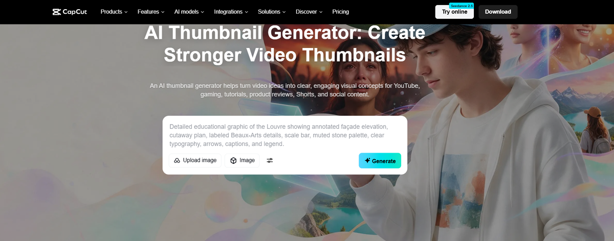
Speed is the real barrier. A tool like an ai thumbnail generator can shorten the process by turning a prompt or a product shot into several layout options. Teams can then pick the strongest version instead of starting from a blank canvas. It works best as a drafting aid, with a human reviewing every result for brand fit.
What Makes a High-Performing Retail Thumbnail?
Strong thumbnails share a few habits. None of them require advanced design skills.
Show the Product Clearly
The product should be the hero. A shopper scanning a feed needs to understand what the video is about in one glance. A close crop of a sneaker, a skincare bottle, or a kitchen gadget beats a wide, cluttered shot.
Clean backgrounds help. A plain or softly blurred backdrop keeps attention on the item. Busy store shelves or messy rooms compete with the product.
Use One Clear Focal Point
Thumbnails display at small sizes, especially on mobile. Every extra element shrinks the impact of the main one. A good test is the squint check. If the main subject disappears when the image is shrunk to the size of a postage stamp, the design is too crowded.
Keep Text Short and Readable
Text can add context, but less is better. Three to five words usually work. Examples include “Under $50,” “Honest Review,” or “Spring Sale.”
Font size matters more than font style. Bold, high-contrast lettering stays readable on small phone screens. Thin script fonts tend to vanish. Text should also avoid the bottom right corner, where timestamps often cover it.
Use Faces and Emotion With Purpose
Human faces draw the eye. A genuine reaction to a product can signal authenticity and curiosity. This works well for reviews, tutorials, and try-on videos.
Forced expressions can backfire. Shoppers have learned to spot exaggerated reactions, and some read them as clickbait. A natural smile or a focused look usually builds more trust than a shocked face.
Build Contrast With Color
Color decides whether a thumbnail stands out in a crowded feed. Many feeds use white or dark interfaces, so a thumbnail with a muted palette can blend into the background. A bold accent color around the product often helps it pop.
Brand consistency still matters. Using the same two or three colors across a series helps loyal viewers recognize new uploads at a glance.
How Do Different Retail Video Types Need Different Thumbnails?
One style does not fit every video. The table below outlines practical starting points.
| Video type | Thumbnail focus | Text approach |
|---|---|---|
| Product demo | Close shot of the item in use | Benefit in 3 to 4 words |
| Unboxing | Package and reaction | Product name only |
| Sale or promotion | Offer and product together | Discount amount, large font |
| Buying guide | Several products side by side | Question or ranking hook |
| Behind the scenes | Real people and workspace | Minimal or none |
| Customer story | Customer face and product | Short quote fragment |
These are starting points, not rules. Every audience behaves a little differently, which is why testing matters.
How Should Retailers Test Thumbnails?
Guessing is the most common thumbnail mistake. A design that feels right to the team may underperform with real shoppers. Testing replaces opinion with evidence.
YouTube offers a built-in Test and Compare feature that lets creators run multiple thumbnail versions against each other. Teams on other platforms can run manual tests by swapping an image after a set period and comparing CTR across equal time windows.
A few rules keep tests honest:
- Change one variable at a time, such as text, color, or crop.
- Run each version long enough to collect meaningful impressions.
- Compare videos of similar topics and audience size.
- Record results in a shared sheet so patterns build over time.
Patterns matter more than single wins. After ten or twenty tests, a team may learn that close crops beat wide shots, or that price callouts lift CTR for promotions. That knowledge becomes a reusable playbook.
A common blind spot is the gap between CTR and watch time. A thumbnail that overpromises can raise clicks while hurting retention. Viewers who feel misled leave early, and the platform notices. The best thumbnail promises what the video actually delivers.
Which Technical Details Do Retailers Often Miss?
Small technical errors can quietly reduce performance.
- Size and ratio: YouTube recommends 1280 by 720 pixels in a 16:9 ratio, with a file size under 2 MB.
- Mobile preview: Most views happen on phones. Every thumbnail should be checked at a small size.
- File quality: Compressed or pixelated images look careless and reduce trust.
- Safe zones: Key elements should stay away from edges and the timestamp corner.
- Accessibility: Strong contrast helps viewers with low vision read text and shapes.
Retailers publishing across several platforms should also resize for each channel. A vertical short-form cover needs a different layout than a landscape YouTube thumbnail.
How Can Retail Teams Build a Faster Thumbnail Workflow?
Consistency beats occasional brilliance. A repeatable process helps small teams keep quality high while publishing often.
A practical workflow looks like this:
- Plan the thumbnail before filming. Decide on the hero shot and capture a clean still during production.
- Create templates. Save layouts for sales, reviews, and tutorials so only the product and text change.
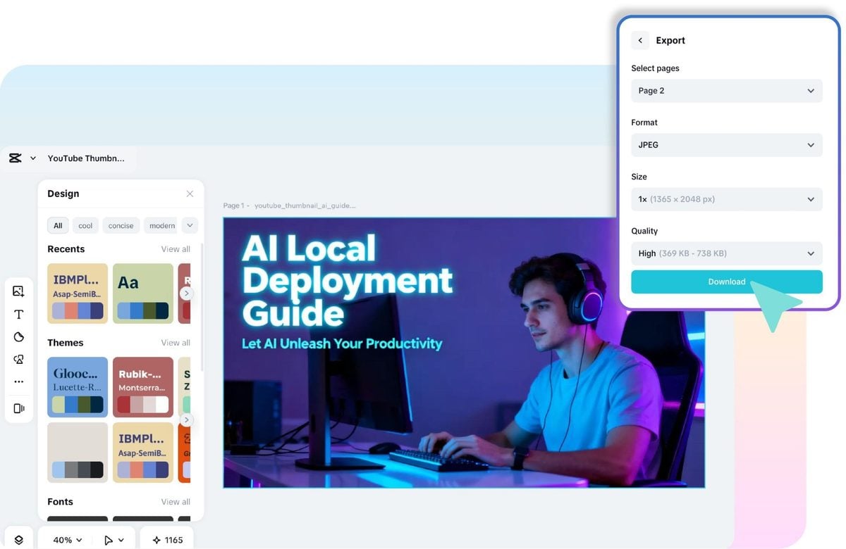
- Generate options quickly. Design editors and AI tools can produce several variations from one product image. Teams then select, refine, and apply brand colors.
- Review against a checklist. Check clarity, contrast, text length, and mobile readability.
- Test and log results. Keep notes on what worked and why.
This approach turns thumbnails from a last-minute chore into a managed asset. It also helps seasonal teams. During peak periods such as the holidays, templates and fast drafting tools prevent quality from slipping when output doubles.
What Mistakes Hurt Thumbnail Performance Most?
A few errors show up repeatedly in retail video:
- Too many elements. Crowded images lose the product in the noise.
- Misleading imagery. Showing a discount or feature in the video never damages trust.
- Inconsistent branding. Random styles make a channel look unfocused.
- Ignoring older videos. Strong evergreen videos with weak thumbnails often benefit most from a refresh.
- Copying competitors blindly. What works for another brand may not suit a different audience or price tier.
Refreshing old thumbnails deserves special attention. A video that already ranks but earns low CTR has proven demand. A better cover image can unlock traffic with no new filming.
Frequently Asked Questions
What is a good CTR for a retail video?
Most channels see between 2 and 10 percent, but the right benchmark depends on traffic source and video type. Comparing the channel’s own history gives the clearest signal.
How often should retailers change thumbnails?
Thumbnails should change when CTR falls below channel average, when products update, or when a seasonal campaign ends. Constant changes make results hard to measure.
Do custom thumbnails really matter?
Yes. Custom images let teams control the message, the product view, and the brand look. Auto-selected frames rarely do any of those well.
Should thumbnails include text?
Short text can add context, especially for sales and comparisons. It should stay readable on a phone and never repeat the full title.
Can AI tools replace a designer?
AI tools speed up drafting and variation. Human judgment still guides brand fit, accuracy, and honesty about what the video shows.
Final Thoughts
Better thumbnails are one of the most affordable ways to improve video performance. They require no new footage, no new ad budget, and no new platform. They need clarity, contrast, honest messaging, and a habit of testing.
Retail brands that treat each thumbnail as a small storefront window tend to learn faster and waste less production effort. Which video in the current library deserves a fresh cover image first?