
By Ani Nersessian
In the realm of retail, the synergy between in-store and online experiences is more crucial than ever. Visual merchandising bridges the gap between these two worlds and elevates the customer journey to new heights of engagement and satisfaction. As we explore this topic, let’s uncover the untapped potential within the union of brick-and-mortar and e-commerce landscapes.
A well-merchandised brick-and-mortar store does not necessarily guarantee a well-merchandised e-commerce shop, and the same applies for the other way around as well. It is quite common for retailers to initiate their retail businesses with a website before they open their first brick-and-mortar store, which can steer the visual merchandising plan of the physical space. An optimized website, in regard to visual merchandising, is one that has fulfilled a full consumer journey: That means capturing the audience’s attention from the home page, enticing them to explore further, making it easy to navigate, encouraging add-ons, and taking them to the cash out point. If the website itself was first optimized, it could be used as a more effective reference for guiding a new in-store set-up. The same would apply in reverse as well: If you have invested more planning into the set-up of your physical shop rather than your website, you can apply some of the consumer journey strategy from your in-store set-up to your website.
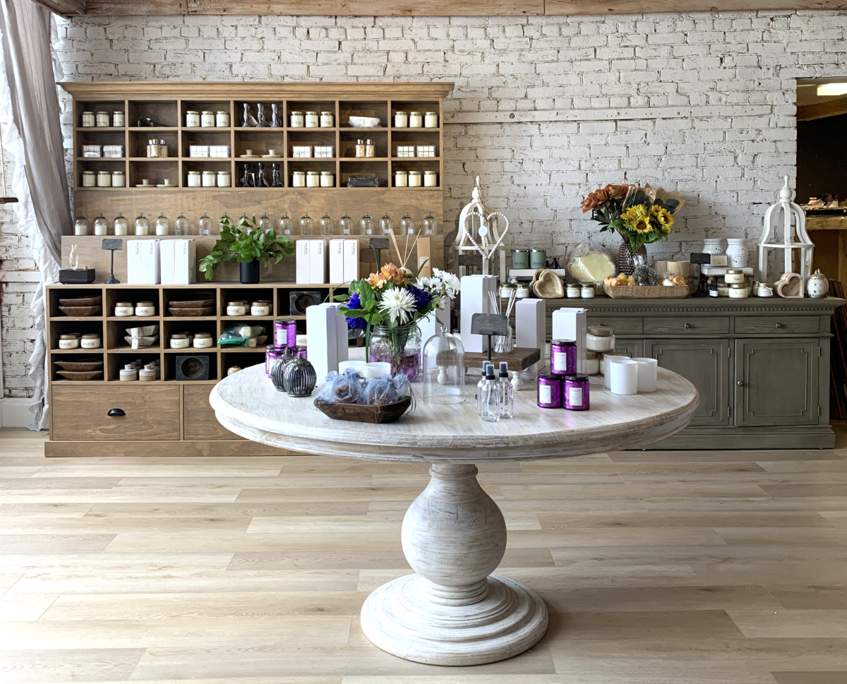
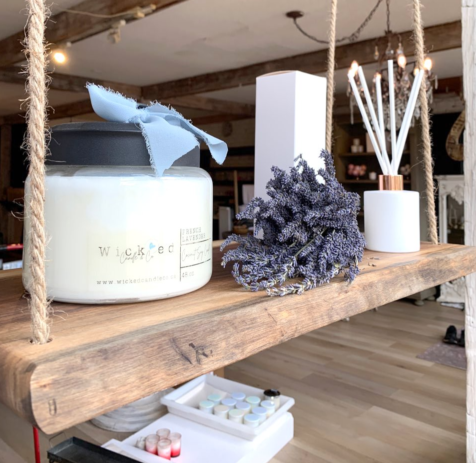
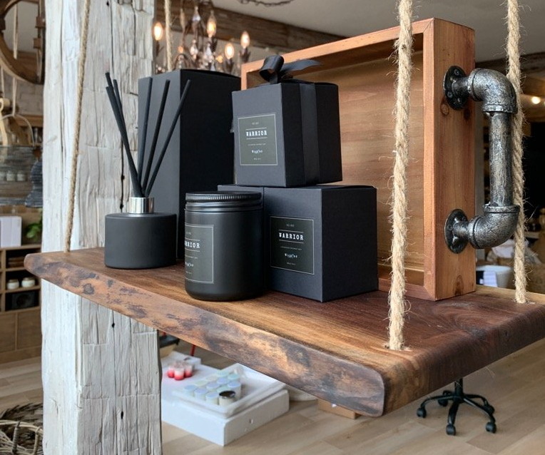
Wick’Ed Fragrance House is an independent home and fragrance shop in Cookstown, Ontario. While Wick’Ed Fragrance House’s online presence is strong, Ela Onisto, the owner, has noticed a surprising trend. Despite the potential for greater online traction due to its smaller-town location, the majority of sales still occur in-store. Ela’s customers often express a preference for the physical shopping experience, finding the ambiance of the store to be particularly inviting and relaxing. Ela has put considerable effort into optimizing the physical space with professional visual merchandising services, resulting in a welcoming environment that resonates with her clientele. While the website offers the same inventory, there remains an opportunity to enhance its appeal to match the inviting atmosphere of the store. Compared to the in-store visual merchandising, the website shopping categories, product groupings, general flow and add-on suggestions are less defined. In-store set-ups can be used as a guideline for setting up the consumer journey on the website in all of the areas that they related to one another, which we will explore further in.
So how can we use e-commerce to unveil opportunities within in-store merchandising, or vice versa? By assessing if and how each consumer journey stage can be further optimized, taking inspiration from the successes of one, to adapt to the other. To do this, we first need to understand the connection between these two worlds.
Let’s compare each key stage of the consumer journey within visual merchandising:
- The Intro
In-Store: Storefront, window display, and in-store front feature area
Online: Home Page and Banner
“The Intro” of each space communicates the brand overall, as well as a reason to walk in. Since these “intro” points are the gateways to the shops, currency and relevance are key, meaning the “Intros” are top in terms of freshness and planning. The most timely significant product features belong here.
- The Space Organization
In-Store: Space Plan and Category Zones
Online: Main Navigation and Sub-Categories
It is quite common to categorize the assortment by their product types. Yet, this could be quite uninspiring for customers. A part of the customer service is not only presenting the assortment, but presenting it as a story, highlighting it as a way to fulfill a need. Let’s look at two familiar yet very different industry titans: Loblaws and Anthropologie. Given their distinctive brands (one being essential and the other being specialty fashion), you may assume consumers’ shopping behaviours and needs are just as different. And while that may be true, both rely on relevant categories on their sites to inspire and ease shopping decisions. Loblaws, for example, has curated sections focusing on the most current relevant themes, in addition to the typical categories by food types; They have a seasonal shop including themes like Parents’ Day, Seasonal Décor, Summer Grilling, Seasonal Allergy Relief, etc.) Their Seasonal produce section highlights the top grocery picks beyond the standard product categories. As well, they have a Discover section to include popular ideas to shop for (e.g. Kids Meal & Snack Ideas, Shop Local, etc.)
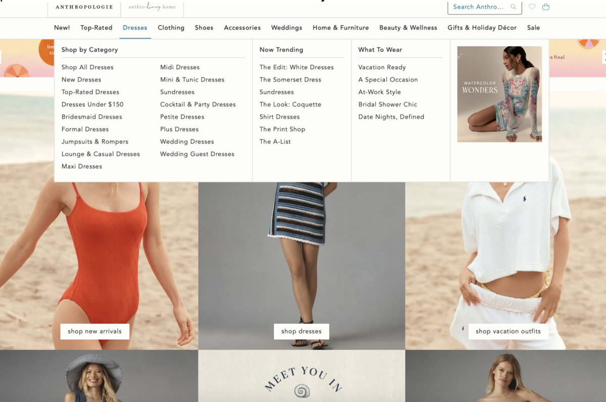
Similarly, Anthropologie ‘s navigation sub-categorizes its overarching product categories for ease, but also includes inspiring themes labelled as “Now Trending” and “What To Wear” sections to present the collections in a more inspiring way. No matter the size of the business, looking at larger companies could be a great source of inspiration for strategy.
Let’s reverse that as well. If an in-store merchandiser has intuitively or strategically curated set-ups based on their observations of shoppers’ behaviours or needs, these curated themes could be guidelines for the e-commerce navigation as well. Practically speaking, you may list more curated themes on a website than in-store due to space constraints.
- The Product Packages
In-Store: Product Adjacencies
Online: Product Listing Pages
Product groupings on a website’s listing page or within the zone of a physical store are known as product adjacencies. Once the categories are selected, deciding which products belong here are key as part of the merchandising and buy plan. This means the products would relate to each other logically, but the order of them also matters. On a webpage, the first positions for the products would be the most important, while in-store, we would prioritize products at eye-level. The data pulled to assess the best sellers would also help decide which are worthy of these key spots within their zones. Placing the main product in the most focal areas with the coordinating pieces in secondary sections would communicate their relationships. For example, on a shelf, you may decide that the main attraction is a cake stand in the centre, gaining the most attention, while the coordinating serving utensils and dessert plates are conveniently placed on either side.
If the quantity of products allocated per webpage or per zone are overwhelming, it would be worthy considering categorizing even further, or using the help of filters to decrease the quantity. Generally, relying on the customer clicking through several webpages would risk them losing interest and losing visibility on the items on the later pages. In-stores, overabundance would mean sacrificing key negative spaces that helps to define one grouping from another. The amount of negative space that is needed would be dependent on the type of retailer, however, it is rare, if ever, that no negative space is needed between product groupings.
It is important to organize products clearly enough and efficiently in order to ease the shopping selection as a part of customer service. The way that our customers shop in-stores could also unveil the filters and tags that would help them to make quicker purchasing decisions online. For example, if the product category is Beauty and Skincare, do the customers shop by brand, skin concern, usage, product type, or all of the above? The order of the customer’s decision-making is important and would affect the overall hierarchy of categorization, as well as define the filters that are needed to help quicker purchasing decisions. For example, If the customer shops by brand first, then by skin concern, the product would be grouped by brand, and within each brand, by skin concern, and lastly by usage. If the brands are less important (or lesser known) than the skin concern, the products would reverse being grouped by skin type first, and then by brand.
- The Key Product Info
In-Store: Product Displays
Online: Product Display Pages
While business owners may know every selling point of a product, we cannot assume they are evident to a customer. Each product display page would need to include every key information about the product including specs and key selling points to help make that shopping decision. While this could be the way it is displayed online, it would mostly rely on the informational text and graphic design to make the information as comprehensible as possible. In contrast, it is not practical nor effective to highlight every piece of information about every product in-stores. There is also less need, given the in-person conversation is also an option in-stores. Therefore, the key selling points of featured products would be important to highlight, which would be communicated by showing the products in context, in usage in a display, highlighting the key features visually, as well as supportive signage. The prioritization and proportions of all of these would be important during planning, so that they are truly effective. In each space, we would need to consider all of the questions that would play a factor in a customers’ shopping decision, for example, options for sizes, colours, price points, materials, etc.
- Last Chance for Add-Ons
In-Store: Impulse Buys or Product Accessories
Online: Product Recommendations
The final opportunity to add-on sales are at the cash desk (the point-of-purchase section) or the bottom of the product listing page, commonly shown under the header of “You may also like….”. Another point, before getting to the end of the consumer journey, is within the product adjacencies: If a consumer is attracted by the main item (e.g. a teapot set), what accessories could be added on to coordinate with this item? You may hope to find teacups, napkins, or tea. These accessories could then also be a part of the add-ons in the online shop, either as product adjacencies within a curated page, or under the “You may also like” section online. To leverage this section, it is advisable to see this truly as an add-on section rather than as an alternative, where the customer may be swapping out their original purchase. In contrast, the point-of-purchase add-ons would be items that are fairly neutral and generic enough to add-on to any purchase, rather than specifically relate to it. It is important to be mindful of what would realistically be added on; smaller items with lower prices would be an easy upgrade, while a larger, more substantial item would be less tempting.
Since we have drawn similarities, it is also important to understand the nuances of each side. It is common for a shop with multiple locations to edit each location based on its local demographic. One way we see this is in its curated assortment plan; while the bulk of it may be cohesive in style for a consistent brand image, the exact same assortment range would not be relevant for every single neighbourhood. In the case of the online world, we do not have the case of considering different neighbourhoods. We do, however, have the capability of catering to an even broader audience, given there is less geographical limitation. That typically means a larger range of assortment which has advantages and disadvantages: The advantage is that you do not have to be quite as selective on what to stock, as long as it is generally relevant (e.g. particularly in the cases of seasonal goods.) However, the hierarchy of features would apply based on the seasonality. The disadvantage is not having the same targeted curation, which means the key feature areas are even more significant to kick off the shopping momentum and gain the interest. It is even easier to give up on the shopping experience when shopping online due to its convenience and ease of exiting. This is why the “key feature areas” are critical to master, as well as understanding which of those curated themes would apply to each local brick-and-mortar location.
In the ever-evolving landscape of retail, mastery of visual merchandising is a cornerstone of success. By embracing the convergence of in-store and online worlds, retailers can unlock a treasure trove of opportunities to captivate audiences, foster brand loyalty, and propel their businesses to new heights of excellence.

After 15+ years of industry experience with various retailers and environments such as Holt Renfrew and Adidas Group Canada, VM ID Inc. was founded by Ani Nersessian to help retailers get set-up with a VM culture that is right for them.
VM ID Inc. is a Visual Merchandising service company which provides catered support for retail businesses through consulting, designing and labour services. Email: ani@vm-id.com