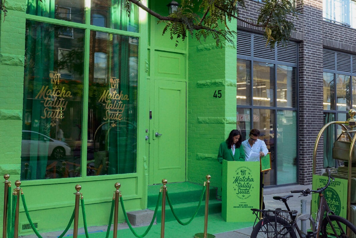
Beverage company Oatly recently transformed a narrow storefront on the popular Ossington Avenue in Toronto into a fully realized, monochromatic-green hotel world. Its Matcha-tality Suite.
It was part luxury suite, part visual joke, and part physical expression of the Oatly Matcha brand.
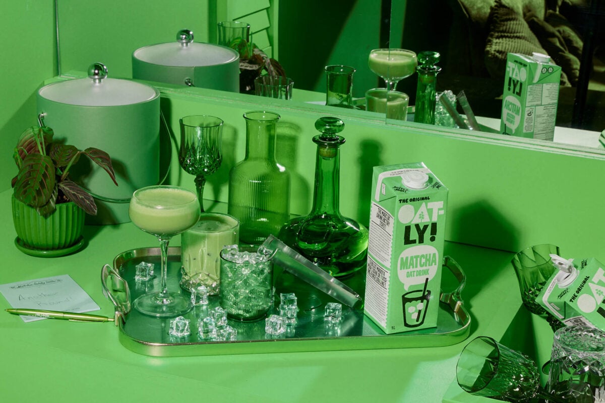
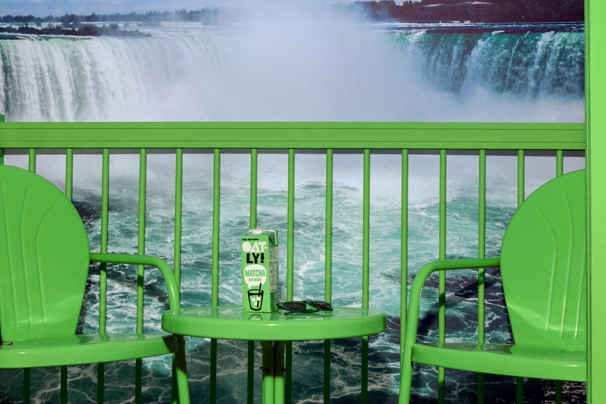
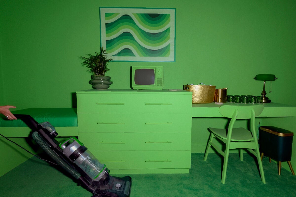
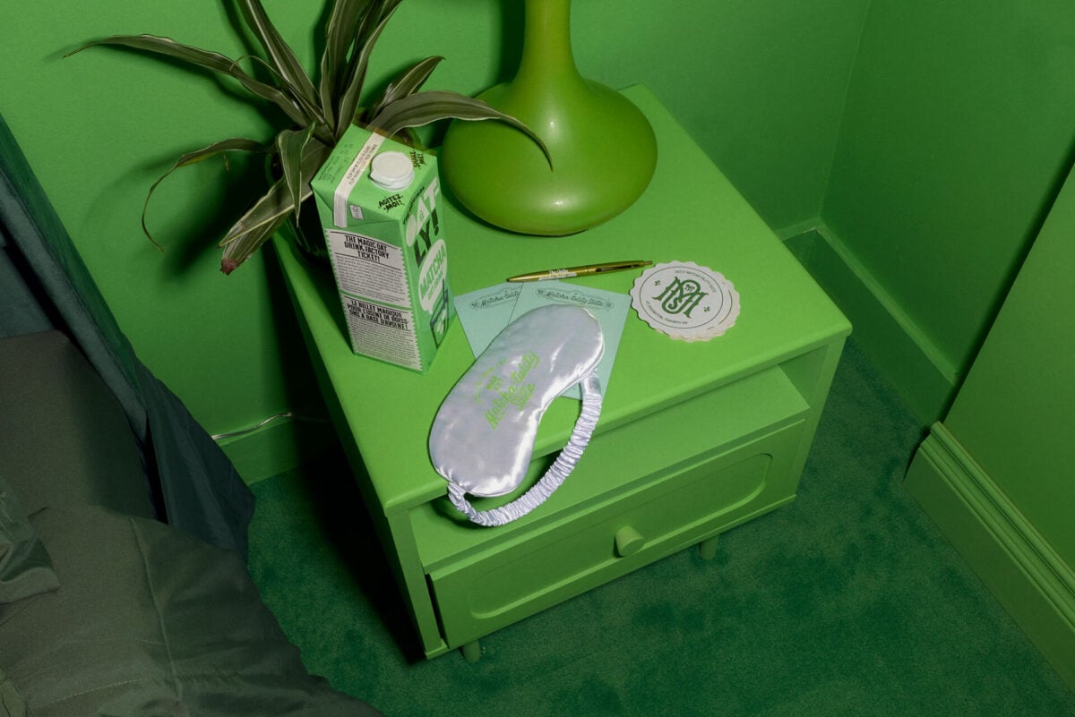
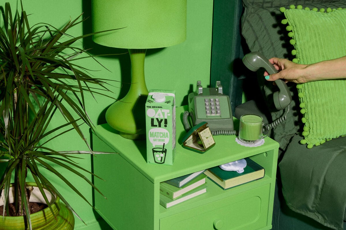
Rather than build a traditional branded pop-up, their creative team treated the space like an actual hotel suite and designed every detail around that fiction: a green bedroom and bathroom, a bathtub filled with Matcha cartons, retro hotel-room objects, custom robes and sleep masks, “stolen from the suite” amenities, a faux balcony overlooking Niagara Falls, room-service styling and an entirely green exterior takeover.
The intention was to create something that felt like a coherent interior and visual identity rather than a collection of branded touchpoints – essentially turning the product’s colour and personality into an inhabitable space.

In an interview with Retail Insider, Emily Keeney, VP of Brand, Oatly, spoke about the initiative.
What was the thinking behind turning Oatly’s Matcha-tality concept into a fully realized hotel suite, rather than a more traditional branded pop-up or retail activation?
We wanted to create something people could actually enter and experience, rather than simply walk past or sample from. The hotel-suite concept gave us a much richer creative framework to work with because it let us build an entire world around Matcha, not just a branded footprint.
A traditional pop-up can sometimes feel like a series of product messages and photo moments. With the Matcha-tality Suite, we could create a space with its own logic, humor and personality, where everything from the room service to the robes to the bathroom details helped tell the same story. That gave people more reasons to stay, explore, interact and ultimately connect with the product in a much more memorable way.
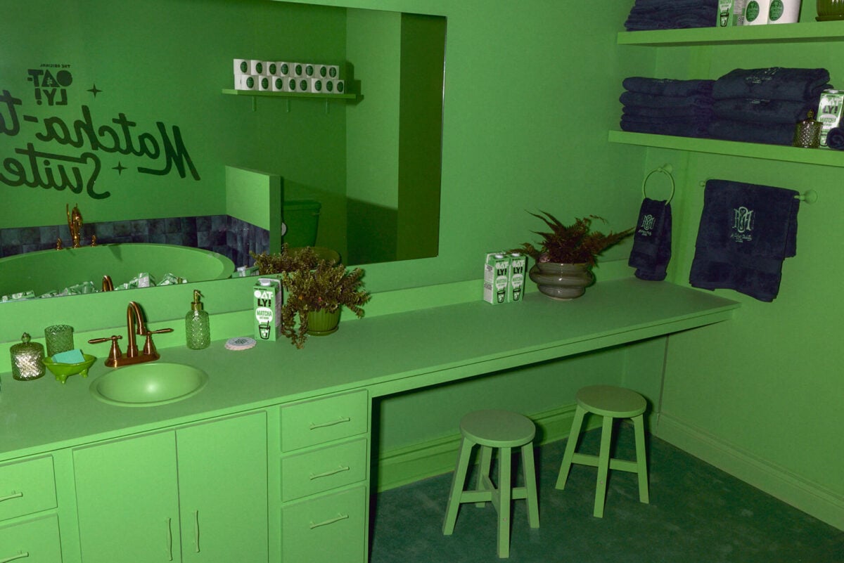
How did your creative team translate the Matcha-tality concept into the physical design of the Ossington Avenue space, from the monochromatic green palette to the furnishings, bathroom, faux balcony and hotel-room details?
Once we committed to the idea of a hotel suite, the creative challenge became making that fiction feel complete.
The monochromatic green palette was the starting point because it immediately connected the space back to Matcha and gave us a strong visual system to build from. From there, the team treated every element as if it belonged in a real hotel room, just filtered through Oatly’s perspective.
That meant thinking about the bedroom, bathroom, wet bar, room-service moments, toiletries, robes, slippers, the retro phone, glassware and even the view outside the “balcony.”
The faux Niagara-front view is probably the clearest example of the tone we were aiming for. It looks polished and immersive, but there is still a joke embedded in it. That balance between craft and absurdity is very Oatly.
What role did the narrow storefront and the Ossington Avenue location play in shaping the design and overall visitor experience?
The narrow footprint actually helped the concept because it naturally created a sequence of spaces rather than one large open room. As people moved through the Suite, they discovered different parts of the hotel world one by one, which made the experience feel more layered and gave us more opportunities for surprise.
Ossington also felt like the right setting because it already has such a strong mix of food, fashion, hospitality and independent retail. We wanted the activation to feel like it belonged in the neighborhood rather than being dropped into it as a temporary branded installation. The location helped us reach people who are already culturally curious and used to discovering new restaurants, shops and experiences in that part of Toronto.
How did Oatly approach balancing the playful elements and visual humour of the suite with the goal of creating a cohesive, immersive environment that people would actually want to spend time in?
The humour only works if the world itself feels convincing.
We did not want the space to feel like a collection of jokes or props. The creative team was very intentional about making the visual language consistent from room to room so that the playful details felt like they belonged inside one coherent environment.
That meant obsessing over things that might seem small: the styling, materials, signage, objects, uniforms, glassware, props and how the product showed up throughout the space. The jokes are there, but they are embedded in a place that still feels designed, considered and comfortable enough that people actually want to hang out in it.
What did Oatly learn from the Matcha-tality Suite about using physical spaces and experiential design to build a connection between a product and consumers?
The biggest takeaway is that physical spaces can make a product feel much more dimensional.
People are surrounded by product messaging all day, so simply telling them why they should care is rarely enough. Experiential design gives you an opportunity to create a feeling around a product and let people discover it for themselves.
With the Matcha-tality Suite, the product became part of a broader experience that people could taste, photograph, talk about and spend time inside. That kind of interaction creates a different kind of memory than a traditional ad or sampling moment.
It also reinforced something we believe strongly at Oatly: when you create something people genuinely want to participate in, the brand message travels further because consumers become part of telling the story themselves.
More from Retail Insider: